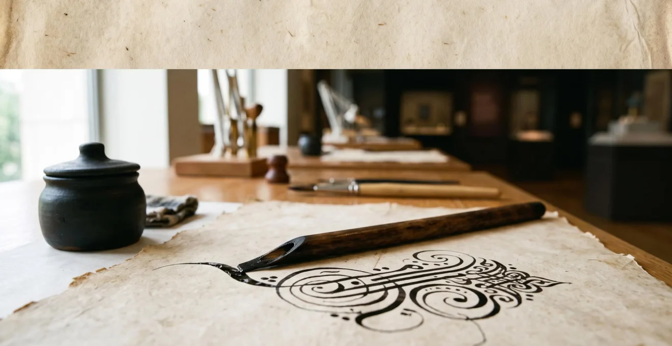
Arabic calligraphy’s status as a supreme art stems not from mere beauty, but from a systematic fusion of spiritual purpose, geometric precision, and institutionalized training.
- The sanctity of the Qur’an provided the initial impetus, turning the act of writing into an act of worship.
- Masters like Ibn Muqla then codified this devotion into a mathematical science of proportion, transforming script into a visual representation of cosmic harmony.
- A formal system of apprenticeship and certification (the Ijazah) ensured this complex knowledge was preserved and transmitted across centuries.
Recommendation: To truly appreciate a calligraphic work, look beyond its aesthetic flow and analyze the underlying structure, script choice, and historical lineage—the hidden geometry of its spirit.
For centuries, the flowing lines of Arabic calligraphy have captivated artists, designers, and scholars. We instinctively recognize its beauty, but often perceive it as an enigmatic, purely aesthetic pursuit. It is easy to admire the elegant curves of a Naskh script or the monumental authority of Kufic, yet still miss the intricate system operating beneath the surface. This appreciation, while valid, stops short of understanding the true genius of the art form.
Many discussions correctly identify the art’s connection to the Qur’an, or list the various script styles. This foundation is crucial, but it doesn’t explain the critical leap: how did writing, a utilitarian tool, evolve into what many consider the highest form of Islamic art? Why did this particular tradition develop a level of structural and philosophical complexity that far surpassed that of many other writing systems? The answer lies not just in devotion, but in the creation of a complete ecosystem of rules, theory, and practice.
The true revolution was the transformation of reverence into a codified system. This article adopts the perspective of a practitioner, delving into the technical and historical mechanics that elevated script to a spiritual science. We will explore how calligraphy became a spiritual technology for connecting with the divine, how masters like Ibn Muqla established a timeless system of proportional harmony, and how institutionalized mastery ensured this knowledge would not only survive, but flourish for over a millennium. By understanding the *how*, we can finally grasp the profound *why* behind its supreme status.
This exploration will guide you through the core principles and historical turning points that defined the art. We will examine the spiritual drivers, the rigorous training, the functional choices between scripts, and the lives of the masters who shaped its legacy.
Summary: How Calligraphic Scripts Became a Supreme Art
- Why Did Arabic Calligraphy Become Sacred Art While Latin Script Stayed Utilitarian?
- How Did Calligraphers Achieve Mastery After 15 Years of Daily 8-Hour Practice?
- Kufic or Naskh: Which Script Offers Better Legibility at Small Sizes?
- The Proportional Modification That Got a Master Calligrapher Banned From Court
- When Did Master Calligraphers Choose Kufic Over Naskh: The 6 Contextual Determinants?
- Why Is Ibn Muqla Considered the Greatest Calligrapher After 1,100 Years?
- Why Do Arabesques Avoid Human Figures While Embracing Infinite Plant Life?
- Who Were the Master Calligraphers Whose Styles Defined Islamic Art for Centuries?
Why Did Arabic Calligraphy Become Sacred Art While Latin Script Stayed Utilitarian?
The divergence between Arabic and Latin script development is rooted in theology. While both served to record sacred texts, the Islamic view of the Qur’an as the literal, uncreated Word of God gave the Arabic script a unique spiritual weight. The act of writing the Qur’an was not merely transcription; it was an act of devotion, a way of giving physical form to the divine utterance. To write beautifully was to glorify God. This imperative transformed the craft of writing into a sacred art, a visual form of prayer.
As scholar Seyyed Hossein Nasr articulated, calligraphy provides “the external dress for the Word of God in the visible world.” This concept is central. Where Latin script evolved primarily for legibility, efficiency, and administrative utility within the Church and state, Arabic script was cultivated as a vessel for transcendence. The scribe’s goal was not just to communicate a message but to create an object of contemplation that reflected the perfection of its divine source. Every stroke, curve, and dot was imbued with spiritual significance.
This intrinsic link between the script and the sacred meant that calligraphers were not seen as mere artisans, but as guardians of a holy tradition. As the British calligrapher Soraya Syed describes, the Qur’an plays a direct, formative role in her creative practice, illustrating how practitioners experience their craft as an act of worship. This mindset, which sees the pen as an instrument of piety, is the fundamental reason Arabic calligraphy ascended to a spiritual and artistic plane that remained largely separate from the functional trajectory of its Latin counterpart.
How Did Calligraphers Achieve Mastery After 15 Years of Daily 8-Hour Practice?
The journey to becoming a master calligrapher (khattat) was not a matter of talent alone, but of immense discipline and formalized training. The trope of long, arduous practice is true, but it was channeled through a highly structured system of apprenticeship. This process was designed to internalize not just the physical movements, but the spiritual and geometric principles of the art. The practice was a form of meditation, where repetition forged a direct connection between mind, hand, and soul.
This paragraph introduces the concept of embodied learning in calligraphy. To visualize this process, consider the relationship between a master and a student. The master’s guidance is not just verbal; it is physical, shaping the student’s hand and posture over thousands of hours.
As the image suggests, this hands-on transmission of knowledge was essential. A student would spend years under a master, copying their work and slowly absorbing the subtle nuances of pressure, angle, and rhythm. The ultimate goal of this training was to earn the Ijazah, or license to practice and teach. This was not a quick process; as one contemporary Ijazah-holding calligrapher recounts, her own formal training took seven years of dedicated study. This period of intense, supervised practice ensured a continuity of style and quality.
The Function of the Ijazah
The Ijazah was more than a certificate of completion; it was a formal entry into a lineage of masters. According to the Library of Congress, the official function of the Ijazah was to give a student the authority to sign their own calligraphic works, allowing them to become independent and take on pupils. This system of institutionalized mastery ensured that skill was not self-declared but formally certified, maintaining an unbroken chain of knowledge and preserving the integrity of the art form across generations.
Kufic or Naskh: Which Script Offers Better Legibility at Small Sizes?
While both Kufic and Naskh are foundational scripts, they were designed for vastly different contexts and scales, directly impacting their legibility. Kufic, with its angular, rectilinear structure and heavy horizontal baseline, is monumental and stately. It excels at large scales, such as architectural inscriptions and early, large-format Qur’ans, where its gravitas and clarity can be appreciated from a distance. However, its dense, static forms and the early lack of consistent diacritical marks make it challenging to read in small, continuous text.
Naskh, which emerged as the dominant script for book copying from the 10th century onward, was the answer to this problem. Its rounded, curvilinear letterforms and clear, well-defined connections were optimized for the reed pen on paper. This structure naturally accommodates the dots and vowel marks (diacritics) essential for unambiguous reading, making it far superior for legibility at smaller sizes. Its design facilitates a continuous, forward-moving rhythm that is ideal for reading extended passages. Turkish scholar Mahmud Yazir aptly characterized this quality with the phrase “breath-like flow,” capturing the script’s effortless grace and readability.
The following table, based on information from institutions like the Asian Art Museum, breaks down the fundamental differences that determine their ideal use cases and, consequently, their legibility at different scales.
| Criterion | Kufic | Naskh |
|---|---|---|
| Era of dominance for Qur’anic copying | 7th–10th century | 10th century onward |
| Letterform structure | Angular, rectilinear, heavy horizontal baseline | Rounded, curvilinear, flowing connections |
| Diacritic integration | Denser, less accommodating of added marks | Structurally designed to accommodate vowel and dot marks |
| Ideal medium | Stone, tile, monumental inscriptions | Reed pen on paper, continuous text |
| Typical use case | Chapter headings, architectural inscriptions, early Qur’ans | Books, correspondence, small-format Qur’ans |
Therefore, for any application requiring legibility in small-format continuous text, such as in a book or on a digital screen, Naskh is unequivocally the better choice. Kufic’s strength lies in its symbolic and architectural impact, not its efficiency for personal reading.
The Proportional Modification That Got a Master Calligrapher Banned From Court
The story of Ibn Muqla (d. 940 CE) is a dramatic testament to the high stakes of calligraphic innovation. Before him, scripts were largely regional and unstandardized. Ibn Muqla revolutionized the art by introducing a system of proportional harmony known as al-khatt al-mansub (proportioned script). This system was based on a simple but brilliant idea: the rhombic dot, created by a single press of the reed pen, would become the fundamental unit of measurement for every letter in the alphabet. The height of the Alif (the first letter) was set at a specific number of dots, and every other letter was defined by precise geometric relationships to it.
This paragraph explains the core of Ibn Muqla’s system. The image below provides a macro view of that foundational unit—the single rhombic dot—that enabled this entire science of proportion.
As the macro view shows, this dot is the DNA of the script. By codifying letterforms with mathematical precision, Ibn Muqla elevated calligraphy from a craft to a science. His genius was such that a traditional aphorism claimed “writing was poured upon his hand as if it was revealed to the bees making their hexagonal honey cells.” Yet this very genius, which gave him immense authority, also entangled him in treacherous court politics.
The Price of Genius: Ibn Muqla’s Fall
Ibn Muqla was not just a calligrapher; he was a vizier who served three successive Abbasid caliphs. His artistic authority and political power made him enemies. As one technical history of Arabic typography recounts, he “was imprisoned by two of them; the third had his right hand amputated on a charge of treasonous correspondence.” This brutal punishment was intended to end his career, but legend holds that he continued to write by strapping a reed pen to his mutilated arm. This story, whether literal or apocryphal, illustrates the profound link between artistic innovation, political power, and personal risk in the classical Islamic world. His system was a modification so powerful it was deemed a threat.
When Did Master Calligraphers Choose Kufic Over Naskh: The 6 Contextual Determinants?
The choice between Kufic and Naskh (or other cursive scripts) was never arbitrary. It was a strategic decision guided by a set of well-understood contextual determinants. A master calligrapher was also a master of context, selecting the script that best served the function, medium, and symbolic intent of the work. Kufic was the language of permanence, authority, and architectural integration, while Naskh spoke of fluidity, accessibility, and scholarly transmission.
This section explores the decision-making process. The illustration below captures the essence of Kufic’s architectural integration—it is not merely written on the wall, but becomes part of the building’s very fabric, woven into the geometric patterns.
This visual fusion of script and structure is a key reason for choosing Kufic in an architectural context. The script’s angularity harmonizes with geometric tilework (zillij) and arabesque patterns, creating a unified aesthetic. Beyond the medium, the intended reading pace and symbolic function were critical. Kufic, with its stately and deliberate rhythm, forces a slow, contemplative reading suitable for a sacred space. Naskh, with its faster, flowing rhythm, is designed for efficient information transfer in a book or manuscript.
The following table outlines the key determinants guiding a calligrapher’s choice, showing the clear functional dichotomy between the two script families.
| Determinant | Favors Kufic | Favors Naskh / Cursive Scripts |
|---|---|---|
| Materiality | Stone, tile, brickwork, rigid surfaces | Reed pen on paper or parchment |
| Symbolic function | Evoking early Islamic authority and piety | Everyday transcription and continuous reading |
| Reading pace | Slow, stately, monumental rhythm | Fast, fluid, forward-moving rhythm |
| Architectural integration | Woven directly into geometric tiling and arabesque patterns | Applied onto a surface rather than structurally integrated |
| Typical application | Chapter headings, mosque foundations, large Qur’ans | Small Qur’ans, books, correspondence |
Action Plan: Choosing the Right Script for a Project
- Define the Medium: Will the work be on a rigid, architectural surface (stone, tile) or a flexible one (paper, screen)? The former favors Kufic’s structure, the latter Naskh’s flow.
- Assess the Function: Is this a monumental heading meant to be seen, or continuous text meant to be read? Choose Kufic for impact, Naskh for legibility.
- Consider the Desired Emotion: Do you need to convey ancient authority and permanence (Kufic) or accessible elegance and fluidity (Naskh)?
- Analyze the Reading Context: Will it be viewed from a distance in a public space (Kufic) or read up close in a personal setting (Naskh)?
- Check for Diacritics: Does the text require extensive vowel marks and dots for clarity? Naskh’s open structure is far better suited for this than the dense forms of Kufic.
Why Is Ibn Muqla Considered the Greatest Calligrapher After 1,100 Years?
Ibn Muqla’s towering reputation, enduring for over a millennium, rests on a single, monumental achievement: he transformed calligraphy from a disparate collection of regional crafts into a unified, mathematically-grounded art form. He is not just another name in a long line of masters; he is the architect of the entire classical system. His contribution was so fundamental that in the Persian tradition, as noted by sources on Persian calligraphy, “he has even been called a prophet in the field of calligraphy” for establishing its foundational rules.
Before Ibn Muqla, there was writing. After Ibn Muqla, there was a science of calligraphic proportion. His system of al-khatt al-mansub, based on the rhombic dot, provided an objective, replicable framework for aesthetic perfection. This was not a stylistic preference; it was a paradigm shift. He established the principles for what would become known as al-aqlam al-sittah (the Six Pens), the canonical scripts that formed the backbone of classical calligraphy for centuries.
The Enduring Legacy of the Six Pens
Ibn Muqla’s system was so robust that subsequent masters, themselves giants of the art, did not replace it. Instead, they built upon it. Figures like Ibn al-Bawwab (d. 1022) and Yaqut al-Musta’simi (d. 1298) are famed for having refined and perfected the Six Pens, canonizing the system that Ibn Muqla had innovated. Their work represents the maturation of his foundational ideas, not their overthrow. This demonstrates that Ibn Muqla’s role was architectural; he laid a foundation so perfect and so logical that it could be built upon for centuries without needing to be replaced. His system, as one history poignantly notes, outlasted the political regimes that wronged him by over a thousand years.
His greatness lies in the fact that every major calligrapher for a thousand years after him, whether they knew it or not, was working within the geometric and aesthetic framework he engineered. He provided the universal language that allowed the art form to flourish across the Islamic world.
Why Do Arabesques Avoid Human Figures While Embracing Infinite Plant Life?
The development of the arabesque, with its endlessly repeating vegetal and geometric patterns, is a direct creative consequence of Islamic aniconism—the avoidance of figurative imagery, especially in sacred contexts. This principle is not a blanket prohibition on all images, but a strong discouragement of depicting sentient beings, particularly in mosques and Qur’ans, to avoid any possibility of idolatry. This theological constraint became a powerful aniconic impetus, redirecting immense artistic energy away from figurative representation and toward other forms of visual expression.
Denied the option of illustrating holy texts with human figures, artists and calligraphers elevated the script itself to a primary art form. The same creative impulse gave rise to the arabesque. Instead of depicting a story through characters, artists sought to express core theological concepts—such as the infinite, unified, and transcendent nature of God—through abstract means. The infinite patterns of the arabesque, which can be extended in any direction without diminishing their coherence, became a perfect visual metaphor for the divine.
Since Islam does not permit illustrating holy texts with images of human figures, the script itself became art.
– The Heritage Lab
The choice of plant life and geometry was deeply symbolic. The endlessly scrolling vines, leaves, and flowers (often called islimi patterns) represent the created world and the life-giving power of God. Geometric patterns (girih) reflect the underlying order and harmony of the universe. Together, they create a visual language that is simultaneously beautiful and deeply metaphysical. It allows the eye to wander without settling on a single focal point, encouraging a contemplative state of mind rather than a narrative interpretation. This approach was further reinforced by mystics like Ibn Arabi, who composed profound meditations on the divinity of the language and the letters themselves, solidifying the focus on abstract and script-based devotion.
Key Takeaways
- Spiritual Driver: Calligraphy became a supreme art because it was seen as the physical embodiment of the divine Word, making its beautiful execution an act of worship.
- Geometric Codification: Ibn Muqla’s proportional system transformed calligraphy from a craft into a science, grounding its aesthetics in mathematical harmony.
- Institutionalized Mastery: The rigorous apprenticeship and Ijazah certification system created an unbroken chain of knowledge, preserving and transmitting high standards for centuries.
Who Were the Master Calligraphers Whose Styles Defined Islamic Art for Centuries?
While Ibn Muqla laid the foundation, a succession of masters built upon his system, each adding their unique refinements and, in some cases, inventing entirely new scripts that defined the aesthetic of entire empires. These figures were celebrities of their time, and their hands shaped the visual culture of the Islamic world for centuries. Their styles were not just personal quirks; they were canonical standards that were studied, copied, and revered by generations of students.
Following Ibn Muqla, Ibn al-Bawwab (“son of the doorman,” d. 1022) is credited with refining the Six Pens, giving them the elegance and clarity we associate with them today. He famously produced one of the earliest Qur’ans written entirely in a cursive script, demonstrating the viability of Naskh for the holiest of texts. A century and a half later, Yaqut al-Musta’simi (d. 1298), a calligrapher in the final Abbasid court in Baghdad, canonized the Six Pens and is credited with perfecting the technique of cutting the reed pen (qalam) at an oblique angle, which allowed for greater finesse and elegance in the strokes.
The tradition also saw radical innovations. According to the Smithsonian’s National Museum of Asian Art, tradition holds that Mir Ali Tabrizi (active c. 1370–1410) invented the Nasta’liq script after a vision in which he was told to draw letters that resembled the wings of flying geese. This new script, with its distinctive downward-sloping lines and delicate, flowing connections, became the preeminent script of Persianate culture. Because of its elegance, Nasta’liq has come to be known as the “bride of Islamic calligraphy.” In the Ottoman sphere, Sheikh Hamdullah (1436–1520) re-codified and rationalized the Six Scripts, creating the definitive Ottoman style that would dominate for 400 years.
The following table summarizes the contributions of these key figures, who represent the major milestones in the development of classical Islamic calligraphy.
| Master | Era | Signature Contribution |
|---|---|---|
| Ibn Muqla | d. 940 CE | Codified the proportional system (al-khatt al-mansub) and the Six Pens |
| Ibn al-Bawwab | d. 1022 CE | Refined the proportions, extended Naskh to Qur’anic copying |
| Yaqut al-Musta’simi | d. 1298 CE | Canonized the Six Pens, cut the reed nib at an oblique angle |
| Mir Ali Tabrizi | active c. 1370–1410 | Credited with inventing Nasta’liq, the “bride of Islamic calligraphy” |
| Sheikh Hamdullah | 1436–1520 | Rationalized the Six Scripts into the definitive Ottoman style |
The journey from a simple writing tool to a supreme art form was driven by a powerful synthesis of faith, intellect, and discipline. To appreciate a piece of calligraphy is to appreciate this entire history. The next step is to begin analyzing the works you encounter not just as beautiful objects, but as documents of this profound tradition.